Difference between revisions of "Fields Manager"
(Created page with '*Before creating Custom Fields make sure you already created Custom Field Groups. *To create a listing custom field select 'Listing' for Location in the top left corner and click…') |
|||
| (40 intermediate revisions by 3 users not shown) | |||
| Line 1: | Line 1: | ||
| − | + | __TOC__ | |
| − | + | ||
| − | + | ||
| − | + | ||
| + | After you created field groups, go to the '''Fields Manager''' to create custom fields for those fields groups. | ||
| − | + | To create a Listing custom field, select ''Listing'' for the Location on the top left corner and click '''New''' on the top right corner. To create a Review custom field select 'Review' for the Location and click '''New'''. | |
| − | + | [[File:creating-fields.png]] | |
| − | + | ||
| − | + | ||
| − | + | ||
| − | ''' | + | After you click '''New''', you will be taken to the Field creation screen. Most of the field settings are optional. To quickly create a field, enter the '''Title''', '''Type''' and '''Field Group''' ('''Name''' will be generated automatically) and click the '''Save''' button: |
| − | + | ||
| − | + | [[File:creating-fields2.png]] | |
| − | + | ||
| − | + | == Field Settings == | |
| − | + | ||
| − | + | These are the common field settings that are available for most types of custom fields: | |
| − | + | ||
| − | + | [[File:creating-fields3.png]] | |
| − | + | ||
| − | ''' | + | * '''Title''' - this is a label that will be displayed next to the field input on submit forms and next to the field value on listing pages. |
| − | + | * '''Name''' - name is used for database reference only. JReviews will append "jr_" as name prefix when the field is saved. You will use the field's name in the theme files, if you want to modify the default layout and placement fields. | |
| − | * | + | * '''Type''' - each of the field types is explained separately below. |
| + | * '''Maximum Characters''' - limits the number of characters allowed for this field. It is important to set this number, otherwise the number of the custom fields that you will be able to create won't be large. For example, if you are creating a ''City'' custom field, enter the maximum number of characters that a single city could have (i.e. 30). For multiple select and checkbox fields keep in mind that the selected options are all stored in the same input so the length should accomodate all the selected options and would be longer than your typical single and radio button fields. | ||
| + | * '''Field Group''' - each custom field can be assigned to a single Field Group. | ||
| + | * '''Required''' - if set to ''Yes'', users will not be able to submit a listing unless they enter a value for this field. | ||
| + | * '''Enabled''' - must be set to ''Yes'', otherwise it's as if the field doesn't exist. | ||
| − | + | [[File:creating-fields4.png]] | |
| − | + | ||
| − | ''' | + | * '''Show title''' - shows the field title on listing detail page or list pages. This setting is not used for submit forms. |
| − | * | + | * '''Show in Detail View''' - if disabled, the field will not be outputted on listing detail pages. If you want to place the field manually in the theme instead of using the default output, set to No. |
| + | * '''Show in List View''' - shows the field on category, search and other list pages. | ||
| + | * '''Show in Compare View''' - shows the field on listing comparison pages. | ||
| + | * '''Enable for ordering''' - shows the field in the ordering dropdown list on list pages. | ||
| + | * '''Click2Search''' - makes the field value clickable to allow users to find other items with the same value (field values become "virtual categories"), except for the website field. | ||
| − | + | [[File:creating-fields5.png]] | |
| − | + | ||
| − | ''' | + | * '''Control Field''' - the field will be hidden on the submit form until the control field that you enter here is selected first. |
| − | * | + | * '''Control Value''' - if you selected the ''control field'', it is required to select a control value after which the field will show up. |
| − | + | [[File:creating-fields6.png]] | |
| − | + | ||
| − | ''' | + | * '''Description''' - enter the field description for submit forms to provide more info to users regarding what they need to enter as field value. The description can be shown as: |
| − | * | + | ** tooltip next to the field title |
| + | ** text above the field input | ||
| + | ** text below the field input | ||
| − | ''' | + | [[File:creating-fields7.png]] |
| − | *The field | + | |
| + | * '''Submit/Edit Access''' - only selected user groups will see the field when submitting a new entry or editing an existing one. | ||
| + | * '''View/Search Access''' - only selected user groups will see or search this field. | ||
| + | |||
| + | [[File:creating-fields8.png]] | ||
| + | |||
| + | * '''Validation Regex''' - field value that users enter will need to pass the validation based on the regex you enter here. Some field types like ''website'' and ''email'' have a default regex which prevents them from entering invalid urls or email addresses. | ||
| + | * '''Allow HTML''' - if enabled, users will be able to enter simple html tags, for example: | ||
| + | <source lang="php"> | ||
| + | <b>Bold Text</b> | ||
| + | <i>Italic Text</i> | ||
| + | </source> | ||
| + | |||
| + | * '''Click2Search URL''' - here you can adjust the url of Click2Search pages. For example, if you want the pages to return listings from the same category instead of from the same listing type, replace '''criteria:{criteriaid}/''' with '''cat:{catid}/'''. Available tags are {criteriaid}, {catid}, {optionvalue}, {optiontext}, {fieldname} and {itemid}. | ||
| + | * '''Output Format''' - here you can adjust the output of the field. The {fieldtext} tag represents the saved field value. If you want to add some custom text next to the field value, add it before or after this tag. To add a value of some other custom fields, use {jr_fieldname} tag (use an actual field name). | ||
| + | * '''Click2search Output Format''' - this setting is useful if you want to modify the click2search links (i.e. add additional attributes to the link). | ||
| + | * '''Apply Output Format Before Click2Search''' - if enabled, the modified output format will be included in click2search links as well. | ||
| + | * '''PHP Based Formatting''' - here you can apply PHP code to the output of the field. Returning boolean false hides the field. Code errors may break the page where the fields are shown. Read more about [[PHP Based Formatting]]. | ||
| + | |||
| + | == Types of custom fields == | ||
| + | |||
| + | '''Text field''' | ||
| + | |||
| + | This is a regular text input. Use it when none of the other field types are better for entering a specific value (i.e. when every entry will have a unique value). | ||
| + | |||
| + | Example of the text field on the submit form: | ||
| + | |||
| + | [[File:text-field.png]] | ||
| + | |||
| + | '''Text area''' | ||
| + | |||
| + | This is a regular textarea form field. Use it when users are expected to enter a lot of text as field value. | ||
| + | |||
| + | Example of the text area field on the submit form: | ||
| + | |||
| + | [[File:textarea.png]] | ||
| + | |||
| + | '''Code enabled Text area''' | ||
| + | |||
| + | The same as regular text area, except it allows entering javascript code. This is useful for affiliate code and various javascript widgets. '''Important:''' Only administrators should be allowed to enter values into this field (for security reasons), select only '''Super User''' group in the Submit/Edit Access setting. | ||
| + | |||
| + | '''Email address''' | ||
| + | |||
| + | The same as regular text field, but with email input validation. The output shows a linked email that opens the user's default email client. | ||
| + | |||
| + | '''Website url''' | ||
| + | |||
| + | Text field with website url input validation. The output shows a linked website address that takes the user to that website. This field type has a different default ''Output Format'' than other field types: | ||
| + | |||
| + | <pre class="html"><a href="{fieldtext}" target="_blank">{fieldtext}</a></pre> | ||
| + | If the urls that users will enter will be very long, you might want to link to display "visit website" instead of the full url. To do that, adjust the Output Format like this: | ||
| + | |||
| + | <pre class="html"><a href="{fieldtext}" target="_blank">visit website</a></pre> | ||
| + | '''Banner field''' | ||
| + | |||
| + | [[File:banner-field.png]] | ||
| + | |||
| + | This field type doesn't accept any user input (it doesn't show up on submit forms). Any text or code that you enter into the '''Banner Code''' text area will be displayed together with other fields. This is useful for things that will be identical in every listing (i.e. ads). | ||
| + | |||
| + | '''Date field''' | ||
| + | |||
| + | Date field type makes entering date values much easier using the calendar based date picker: | ||
| + | |||
| + | [[File:date-field.png]] | ||
| + | |||
| + | The date field has several additional advanced options: | ||
| + | |||
| + | * '''Date output format''' - here you can adjust the date format that will be used to display the date to site visitors. Examples of different date format parameters can be found on [http://www.php.net/strftime PHP's strftime function]. | ||
| + | * '''Year Range''' - check the [http://api.jqueryui.com/datepicker/#option-yearRange jQuery UI datepicker documentation] for options Relative to today's year -nn:+nn, relative to the currently selected year c-nn:c+nn, absolute nnnn:nnnn, or combinations of these formats nnnn:-nn. Leave empty for +-10 from selected year. | ||
| + | * '''Min Date''' - check the [http://api.jqueryui.com/datepicker/#option-minDate jQuery UI datepicker documentation] for options A string in the format defined by the dateFormat option, or a relative date. Relative dates must contain value and period pairs; valid periods are "y" for years, "m" for months, "w" for weeks, and "d" for days. For example, "+1m +7d" represents one month and seven days from today. | ||
| + | * '''Max Date''' - check the [http://api.jqueryui.com/datepicker/#option-maxDate jQuery UI datepicker documentation] for options A string in the format defined by the dateFormat option, or a relative date. Relative dates must contain value and period pairs; valid periods are "y" for years, "m" for months, "w" for weeks, and "d" for days. For example, "+1m +7d" represents one month and seven days from today. | ||
| + | |||
| + | '''Decimal number''' | ||
| + | |||
| + | This is a text field with decimal numbers input validation. This field type has two additional field options: | ||
| + | |||
| + | * '''Currency Format''' - if enabled, the field value will be displayed as a currency. To add a currency next to the field value, add it to the '''Output Format''' text area before or after the {fieldtext} tag. | ||
| + | * '''Number of Decimals''' - choose how many decimals will be shown in the field output (for non-currency decimal fields) | ||
| + | |||
| + | '''Integer number''' | ||
| + | |||
| + | This is a text field with integer input validation. Keep in mind that this field can store only actual integer numbers without leading zeroes. It is not good for phone numbers and similar, use the text field type instead. | ||
| + | |||
| + | == Adding Field Options == | ||
| + | |||
| + | '''Single select list''' | ||
| + | |||
| + | This is a standard "dropdown" field that allows users to select a single value. | ||
| + | |||
| + | Example of the field on the submit form: | ||
| + | |||
| + | [[File:selectlist-field.png]] | ||
| + | |||
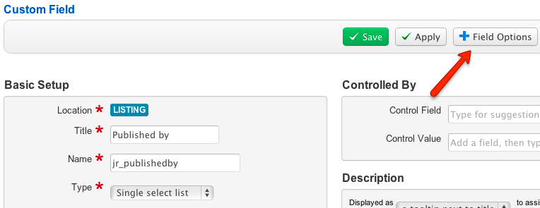
| + | This type of field requires that you create field options that will be offered to users for selection. To create field options, you can click the '''Field Options''' button when editing the field: | ||
| + | |||
| + | [[File:creating-field-options.png]] | ||
| + | |||
| + | or click on the '''+''' button in the Options column next to the field in the Fields Manager: | ||
| + | |||
| + | [[File:creating-field-options2.png]] | ||
| + | |||
| + | On the next screen you will get see a form for creating field options: | ||
| + | |||
| + | [[File:creating-field-options3.png]] | ||
| + | |||
| + | '''Text''' is what will be visible to users. '''Value''' is a database reference and it must be all lowercase and without spaces or specia characters. '''Image''' (optional) allows you to enter a name of the image that will be displayed instead of the field text in the field output. The image needs to be placed inside the ''/theme_images'' directory of the JReviews theme that you selected in JReviews configuration. You'll need to click on '''Clear Cache & File Registry''' link under '''Maintenance''' menu in JReviews administration for JReviews to recognize any images you uploaded to ''/theme_images''. | ||
| + | |||
| + | After you populate the required '''Text''' and '''Value''', click the '''Add''' button in the top right corner to create the field option. | ||
| + | |||
| + | The Single select list field type has additional settings: | ||
| + | |||
| + | * '''Use Auto Complete UI''' - if enabled, the dropdown will be converted to an autocomplete text input for selecting a value. This is useful if you plan to have a large number of options for the field. Users would need to type-in first few letters of the value to select it: | ||
| + | |||
| + | [[File:selectlist-field-autocomplete.png]] | ||
| + | |||
| + | * '''Click2Add''' - this setting is useful if you want to allow adding new options to the select list directly on the submit forms. Otherwise, users would only be able to select field options that you created in the Field Options Manager. | ||
| + | * '''Show option images''' - if disabled, text will show on field value output even if images are assigned to field options. | ||
| + | * '''Option ordering''' - Use ''A-Z'' to order the field options inside the select list alphabetically, or ''User defined order'' for options to be ordered based on the ordering in Field Options Manager. | ||
| + | |||
| + | '''Multiple select list''' | ||
| + | |||
| + | This field works the same as the single select list, except it allows users to select more than one field options. Example of the field on the submit form: | ||
| + | |||
| + | [[File:multiselect-field.png]] | ||
| + | |||
| + | This field type also requires field options to be created and has all the same settings as the single select field. | ||
| + | |||
| + | '''Checkboxes''' | ||
| + | |||
| + | Checkboxes field type is an alternative to multiple select field type for selecting multiple field options: | ||
| + | |||
| + | [[File:checkboxes-field.png]] | ||
| + | |||
| + | The type of the field can be switched from multiple select to checkboxes and vice versa at any time. One of the differences between them is that it is not possible to add more checkboxes on the submit form, all field options must be created in the Field Options Manager. | ||
| + | |||
| + | '''Radio buttons''' | ||
| + | |||
| + | Radio buttons field type is an alternative to single select field type for selecting a single field option: | ||
| + | |||
| + | [[File:radiobuttons-field.png]] | ||
| + | |||
| + | The type of the field can be switched from single select to radiobuttons and vice versa at any time. It is also not possible to add more radio button options on the submit form, all field options must be created in the Field Options Manager. | ||
| + | |||
| + | '''Related Listing''' | ||
| + | |||
| + | This field type doesn't have field options. Instead it allows users to select an exiting listing as the value: | ||
| + | |||
| + | [[File:relatedlisting-field.png]] | ||
| + | |||
| + | The output of this field will be a link that will point to that listing. | ||
| + | |||
| + | This field is useful for '''parent -> child''' field relations. For example, if you have listings for events and venues, you could use this field type in event listings to select a ''parent'' venue listing. | ||
| + | |||
| + | Available options for this field type are: | ||
| + | |||
| + | [[File:relatedlisting-field2.png]] | ||
| + | |||
| + | * '''Listing Type Filter''' - select the listing types that will be used to filter the listing suggestions shown for this field. | ||
| + | * '''Current user only''' - limits suggestions to listings owned by the current user. Editors and above will get suggestions for all listings. | ||
| − | |||
| − | |||
| − | |||
Latest revision as of 20:06, 13 August 2015
After you created field groups, go to the Fields Manager to create custom fields for those fields groups.
To create a Listing custom field, select Listing for the Location on the top left corner and click New on the top right corner. To create a Review custom field select 'Review' for the Location and click New.
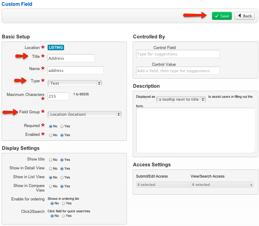
After you click New, you will be taken to the Field creation screen. Most of the field settings are optional. To quickly create a field, enter the Title, Type and Field Group (Name will be generated automatically) and click the Save button:
Field Settings
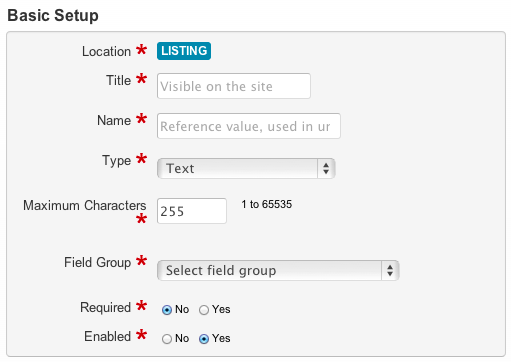
These are the common field settings that are available for most types of custom fields:
- Title - this is a label that will be displayed next to the field input on submit forms and next to the field value on listing pages.
- Name - name is used for database reference only. JReviews will append "jr_" as name prefix when the field is saved. You will use the field's name in the theme files, if you want to modify the default layout and placement fields.
- Type - each of the field types is explained separately below.
- Maximum Characters - limits the number of characters allowed for this field. It is important to set this number, otherwise the number of the custom fields that you will be able to create won't be large. For example, if you are creating a City custom field, enter the maximum number of characters that a single city could have (i.e. 30). For multiple select and checkbox fields keep in mind that the selected options are all stored in the same input so the length should accomodate all the selected options and would be longer than your typical single and radio button fields.
- Field Group - each custom field can be assigned to a single Field Group.
- Required - if set to Yes, users will not be able to submit a listing unless they enter a value for this field.
- Enabled - must be set to Yes, otherwise it's as if the field doesn't exist.
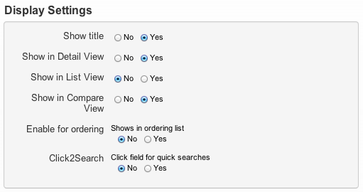
- Show title - shows the field title on listing detail page or list pages. This setting is not used for submit forms.
- Show in Detail View - if disabled, the field will not be outputted on listing detail pages. If you want to place the field manually in the theme instead of using the default output, set to No.
- Show in List View - shows the field on category, search and other list pages.
- Show in Compare View - shows the field on listing comparison pages.
- Enable for ordering - shows the field in the ordering dropdown list on list pages.
- Click2Search - makes the field value clickable to allow users to find other items with the same value (field values become "virtual categories"), except for the website field.
- Control Field - the field will be hidden on the submit form until the control field that you enter here is selected first.
- Control Value - if you selected the control field, it is required to select a control value after which the field will show up.
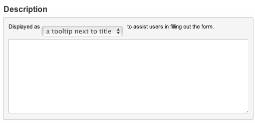
- Description - enter the field description for submit forms to provide more info to users regarding what they need to enter as field value. The description can be shown as:
- tooltip next to the field title
- text above the field input
- text below the field input
- Submit/Edit Access - only selected user groups will see the field when submitting a new entry or editing an existing one.
- View/Search Access - only selected user groups will see or search this field.
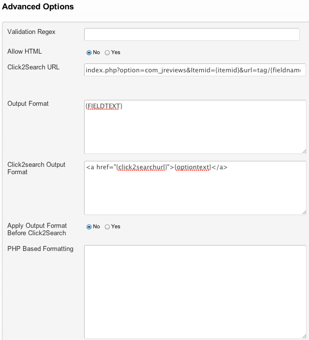
- Validation Regex - field value that users enter will need to pass the validation based on the regex you enter here. Some field types like website and email have a default regex which prevents them from entering invalid urls or email addresses.
- Allow HTML - if enabled, users will be able to enter simple html tags, for example:
<b>Bold Text</b>
<i>Italic Text</i>
- Click2Search URL - here you can adjust the url of Click2Search pages. For example, if you want the pages to return listings from the same category instead of from the same listing type, replace criteria:{criteriaid}/ with cat:{catid}/. Available tags are {criteriaid}, {catid}, {optionvalue}, {optiontext}, {fieldname} and {itemid}.
- Output Format - here you can adjust the output of the field. The {fieldtext} tag represents the saved field value. If you want to add some custom text next to the field value, add it before or after this tag. To add a value of some other custom fields, use {jr_fieldname} tag (use an actual field name).
- Click2search Output Format - this setting is useful if you want to modify the click2search links (i.e. add additional attributes to the link).
- Apply Output Format Before Click2Search - if enabled, the modified output format will be included in click2search links as well.
- PHP Based Formatting - here you can apply PHP code to the output of the field. Returning boolean false hides the field. Code errors may break the page where the fields are shown. Read more about PHP Based Formatting.
Types of custom fields
Text field
This is a regular text input. Use it when none of the other field types are better for entering a specific value (i.e. when every entry will have a unique value).
Example of the text field on the submit form:
Text area
This is a regular textarea form field. Use it when users are expected to enter a lot of text as field value.
Example of the text area field on the submit form:
Code enabled Text area
The same as regular text area, except it allows entering javascript code. This is useful for affiliate code and various javascript widgets. Important: Only administrators should be allowed to enter values into this field (for security reasons), select only Super User group in the Submit/Edit Access setting.
Email address
The same as regular text field, but with email input validation. The output shows a linked email that opens the user's default email client.
Website url
Text field with website url input validation. The output shows a linked website address that takes the user to that website. This field type has a different default Output Format than other field types:
<a href="{fieldtext}" target="_blank">{fieldtext}</a>
If the urls that users will enter will be very long, you might want to link to display "visit website" instead of the full url. To do that, adjust the Output Format like this:
<a href="{fieldtext}" target="_blank">visit website</a>
Banner field
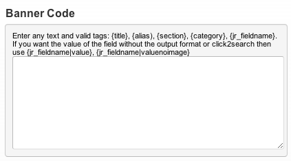
This field type doesn't accept any user input (it doesn't show up on submit forms). Any text or code that you enter into the Banner Code text area will be displayed together with other fields. This is useful for things that will be identical in every listing (i.e. ads).
Date field
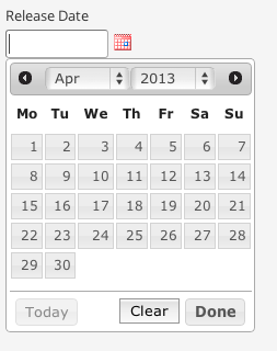
Date field type makes entering date values much easier using the calendar based date picker:
The date field has several additional advanced options:
- Date output format - here you can adjust the date format that will be used to display the date to site visitors. Examples of different date format parameters can be found on PHP's strftime function.
- Year Range - check the jQuery UI datepicker documentation for options Relative to today's year -nn:+nn, relative to the currently selected year c-nn:c+nn, absolute nnnn:nnnn, or combinations of these formats nnnn:-nn. Leave empty for +-10 from selected year.
- Min Date - check the jQuery UI datepicker documentation for options A string in the format defined by the dateFormat option, or a relative date. Relative dates must contain value and period pairs; valid periods are "y" for years, "m" for months, "w" for weeks, and "d" for days. For example, "+1m +7d" represents one month and seven days from today.
- Max Date - check the jQuery UI datepicker documentation for options A string in the format defined by the dateFormat option, or a relative date. Relative dates must contain value and period pairs; valid periods are "y" for years, "m" for months, "w" for weeks, and "d" for days. For example, "+1m +7d" represents one month and seven days from today.
Decimal number
This is a text field with decimal numbers input validation. This field type has two additional field options:
- Currency Format - if enabled, the field value will be displayed as a currency. To add a currency next to the field value, add it to the Output Format text area before or after the {fieldtext} tag.
- Number of Decimals - choose how many decimals will be shown in the field output (for non-currency decimal fields)
Integer number
This is a text field with integer input validation. Keep in mind that this field can store only actual integer numbers without leading zeroes. It is not good for phone numbers and similar, use the text field type instead.
Adding Field Options
Single select list
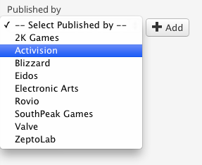
This is a standard "dropdown" field that allows users to select a single value.
Example of the field on the submit form:
This type of field requires that you create field options that will be offered to users for selection. To create field options, you can click the Field Options button when editing the field:
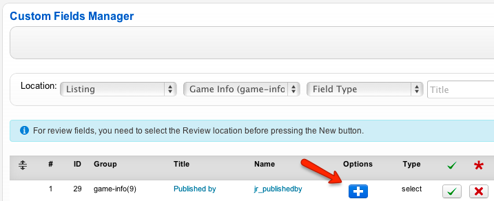
or click on the + button in the Options column next to the field in the Fields Manager:
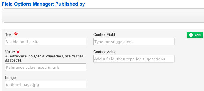
On the next screen you will get see a form for creating field options:
Text is what will be visible to users. Value is a database reference and it must be all lowercase and without spaces or specia characters. Image (optional) allows you to enter a name of the image that will be displayed instead of the field text in the field output. The image needs to be placed inside the /theme_images directory of the JReviews theme that you selected in JReviews configuration. You'll need to click on Clear Cache & File Registry link under Maintenance menu in JReviews administration for JReviews to recognize any images you uploaded to /theme_images.
After you populate the required Text and Value, click the Add button in the top right corner to create the field option.
The Single select list field type has additional settings:
- Use Auto Complete UI - if enabled, the dropdown will be converted to an autocomplete text input for selecting a value. This is useful if you plan to have a large number of options for the field. Users would need to type-in first few letters of the value to select it:
- Click2Add - this setting is useful if you want to allow adding new options to the select list directly on the submit forms. Otherwise, users would only be able to select field options that you created in the Field Options Manager.
- Show option images - if disabled, text will show on field value output even if images are assigned to field options.
- Option ordering - Use A-Z to order the field options inside the select list alphabetically, or User defined order for options to be ordered based on the ordering in Field Options Manager.
Multiple select list
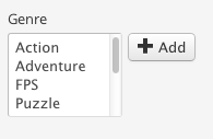
This field works the same as the single select list, except it allows users to select more than one field options. Example of the field on the submit form:
This field type also requires field options to be created and has all the same settings as the single select field.
Checkboxes
Checkboxes field type is an alternative to multiple select field type for selecting multiple field options:
The type of the field can be switched from multiple select to checkboxes and vice versa at any time. One of the differences between them is that it is not possible to add more checkboxes on the submit form, all field options must be created in the Field Options Manager.
Radio buttons
Radio buttons field type is an alternative to single select field type for selecting a single field option:
The type of the field can be switched from single select to radiobuttons and vice versa at any time. It is also not possible to add more radio button options on the submit form, all field options must be created in the Field Options Manager.
Related Listing
This field type doesn't have field options. Instead it allows users to select an exiting listing as the value:
The output of this field will be a link that will point to that listing.
This field is useful for parent -> child field relations. For example, if you have listings for events and venues, you could use this field type in event listings to select a parent venue listing.
Available options for this field type are:
- Listing Type Filter - select the listing types that will be used to filter the listing suggestions shown for this field.
- Current user only - limits suggestions to listings owned by the current user. Editors and above will get suggestions for all listings.

