Difference between revisions of "Creating Widgets"
(Created page with " To create a widget, click the '''Widget Manager''' link in the WidgetFactory add-on. Choose the type of the widget and click '''New''': File:widget-manager.png == Creatin...") |
(No difference)
|
Latest revision as of 14:28, 22 November 2013
To create a widget, click the Widget Manager link in the WidgetFactory add-on.
Choose the type of the widget and click New:
Creating a "Many Listings" widget
Create this type of widget if you want the widget to show multiple listings, for example: top rated listings, most popular listings, listings from a specific category, listings that have a specific field value, etc.
Title – widget title that will be displayed on the widget list page.
Description – enter more info about the widget.
State:
- Published – widget will be available for publishing.
- Unpublished – widget will not be available for publishing, but it will still work if already published on some site.
- Disabled – widget will no longer work on any site.
Some of the widget settings have a checkbox next to the gears icon. When checked, the setting becomes a server-side-only setting and it is excluded from the widget markup code. Publishers won't be able to override it.
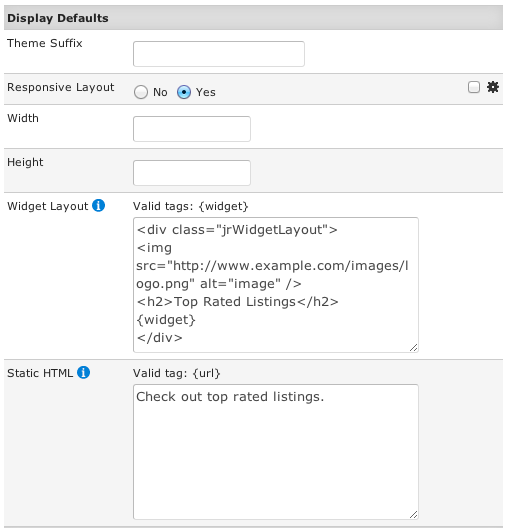
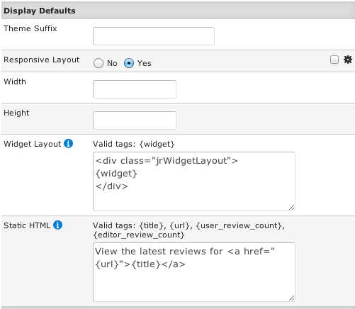
Theme Suffix – here you can define a custom theme file suffix in case you want a different theme file for each widget. More info about this is available in the Customizing Widget Themes chapter.
Responsive Layout – if enabled, the widget will automatically adjust its dimension to fit the available space on the publisher's site.
Width – if you want the widget to have fixed dimensions, enter the width in pixels. If you specify the width and leave Responsive Layout enabled, this width will be used to set the initial widget width.
Height – if you want the widget to have fixed dimensions, enter the height in pixels. If you specify the height and leave Responsive Layout enabled, this height will be used to set the initial widget height.
Widget Layout – here you can enter html code that will wrap the widget. This is useful to add branding logo and widget title.
Static HTML – this is the placeholder text that will be displayed on the publisher site until the widget loads. If you want a link back to your site that can be indexed by search engines for SEO, you will add it here.
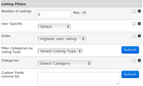
Number of Listings – choose how many listings will be shown in the widget.
User Specific – if you select „My Listings“ or „My Favorites“, when logged in users get the widget code, the widget will show their listings or their favorite listings.
Order – choose how the listings will be ordered.
Filter Categories by Listing Type – if you select a listing type, the next parameter will show only those categories that use the selected listing type. Click Refresh to update the categories.
Categories – if a category is chosen, the widget will show listings only from the selected category.
Custom Fields comma list – here you can enter a list of custom fields (i.e. „jr_state,jr_city“). Click Refresh and then you'll be able to select specific values from those custom fields for the widget to show only listings that have those values.
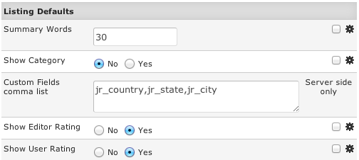
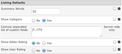
Summary Words – choose how many summary text words the widget will show for each listing.
Show Category – if enabled, the listing category will be displayed below the listing title.
Custom Fields comma list – choose which custom fields will be displayed for each listing.
Show Editor Rating – if enabled, editor rating stars will be displayed.
Show User Rating – if enabled, user rating stars will be displayed.
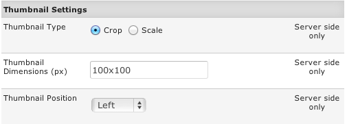
Thumbnal Type – choose Crop or Scale mode for thumbnails.
Thumbnal Dimensions (px) – enter maximum width and height for the thumbnails.
Thumbnail Position – choose where the thumbnail will be positioned in relation to the listing content.
Creating a "One Listing" widget
Create this type of widget if you want the widget to show a single listing. The widget can show all listing details (summary text, custom fields, rating, photos, reviews), but you can also create a compact rating badge. Example of creating a compact rating badge can be found in the Widget Theme Customizations chapter.
Title – widget title that will be displayed on the widget list page.
Description – enter more info about the widget.
State:
- Published – widget will be available for publishing.
- Unpublished – widget will not be available for publishing, but it will still work if already published on some site.
- Disabled – widget will no longer work on any site.
Theme Suffix – here you can define a custom theme file suffix in case you want a different theme file for each widget. More info about this is available in the Widget Theme Customizations chapter.
Responsive Layout – if enabled, the widget will automatically adjust its dimension to fit the available space on the publisher's site.
Width – if you want the widget to have fixed dimensions, enter the width in pixels. If you specify the width and leave Responsive Layout enabled, this width will be used to set the initial widget width.
Height – if you want the widget to have fixed dimensions, enter the height in pixels. If you specify the height and leave Responsive Layout enabled, this height will be used to set the initial widget heigth.
Widget Layout – here you can enter html code that will wrap the widget. This is useful to add branding logo and widget title.
Static HTML – this is the placeholder text that will be displayed on the publisher site until the widget loads. If you want a link back to your site that can be indexed by search engines for SEO, you will add it here.
Summary Words – choose how many summary text words the widget will show for the listing.
Show Category – if enabled, the listing category will be displayed below the listing title.
Custom Fields comma list – choose which custom fields will be displayed for each listing.
Show Editor Rating – if enabled, editor rating stars will be displayed.
Show User Rating – if enabled, user rating stars will be displayed.
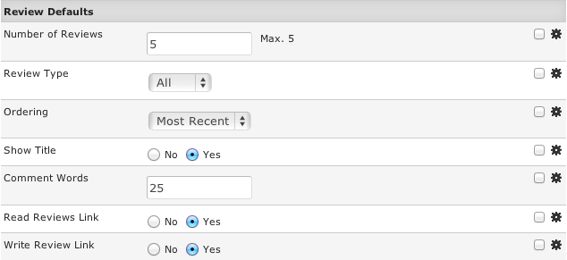
Number of Reviews – choose how many reviews will be shown below the listing details.
Review Type – here you can choose between All reviews, Editor reviews and User reviews.
Ordering – you can order reviews by Most Recent, Most Helpful and Best Rating.
Show Title – if enabled, the review title will be shown.
Comment Words – enter the number of review comment words to show. To hide review comments, enter 0.
Read Reviews Link – if enabled, Read Reviews link will be displayed below the reviews.
Write Review Link – if enabled, Write Review link will be displayed below the reviews.
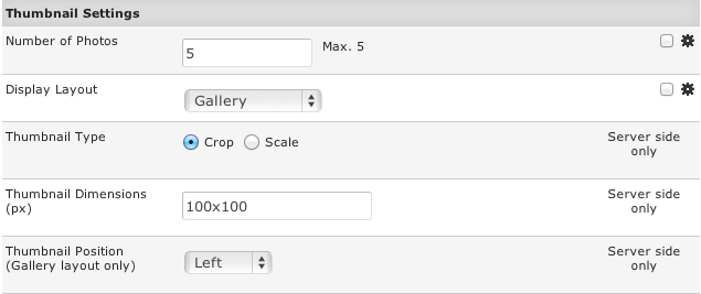
Number of Photos – enter the number of listing photos that the widget will display.
Display Layout – there are two layouts for displaying photos: Gallery and Contact Sheet.
- Gallery layout example (a single photo is displayed with arrows to view other photos):
- Contact sheet example (all photos are displayed below listing details):
Thumbnail Type – choose Crop or Scale mode for thumbnails.
Thumbnal Dimensions (px) – enter maximum width and height for the thumbnails.
Thumbnail Position – choose where the thumbnail will be positioned in relation to the listing content. This setting is used for Gallery layout only.


