Difference between revisions of "Fields Manager"
(→Email address) |
|||
| Line 61: | Line 61: | ||
=== Email address === | === Email address === | ||
| − | *the same as text field, but with email input validation | + | *the same as text field, but with email input validation. The output shows a linked email that opens the user's default email client. |
| − | + | ||
=== Website url === | === Website url === | ||
Revision as of 00:17, 27 August 2010
Contents
- Before you start creating Custom Fields you first need to create the Custom Field Groups that will hold those fields.
- To create a Listing custom field first select 'Listing' for the Location in the top left corner and click on the 'New' button in the top right corner.
- To create a Review custom field select 'Review' for the Location and click on the 'New' button.
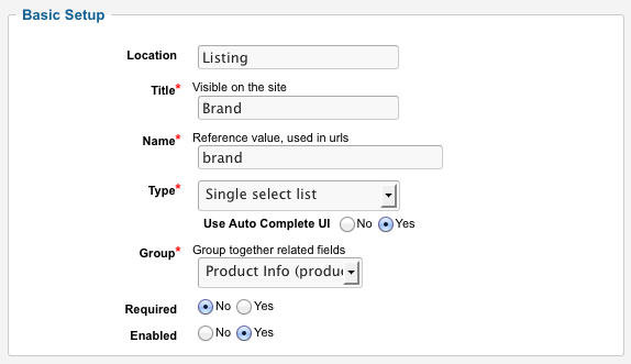
- After you click the 'New' button, you will be taken to the Field creation screen.
Creating New Field
Name is used for database reference only. JReviews will append "jr_" as name prefix when the fields are saved. You will use the field's name in the theme files if you want to modify the default layout and placement fields.
Title is the label that will be displayed in your listing if 'Show Title' is set to yes.
Type - Select one of the Custom Field Types.
Field Group - Assign the field to Field Groups.
Click here for Advanced Options - Here you can change advanced options like Output Format, Regex Format for validation, Click2Seach URL, ...
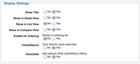
Show Title - Shows the field's label on Listing detail page or Section/Category list page
Show in listing detail view - Shows the field in Listing detail page. If you want to place the field manually in the theme instead of using the default output, set this to No.
Show in list view - Shows the field in Section/Category list pages.
Show in comparison view - Shows the field in the listing comparison page.
Sort by this field in list view - Shows the field in the dropdown list in Section/Category list pages.
Click to Search - Makes the field clickable to allow users to find other items with the same value, except for the website field.
Click to Add - For select lists only. Allows adding more options on the fly while adding/editing a new item.
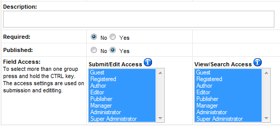
Description - Tooltip to remind users of what they are expected to fill in.
Required - If set to yes, it will not be possible to submit the form when the field value is empty.
Published - The field needs to be published in order for it to show up in the form to submit a new item and for its value to be available in the templates if you decide to place them there manually.
Field Access
- Submit/Edit Access - Only selected user groups will see the field when submitting a new entry.
- View/Search Access - Only selected user groups will see or search this field.
Custom Field Types
Text Field
- text field is a regular text input
- available advanced options: Regex pattern for input validation, Allow HTML (Yes/No), Click2Seach URL, Output Format
- example:
Email address
- the same as text field, but with email input validation. The output shows a linked email that opens the user's default email client.
Website url
- text field with website url input validation
Integer
- text field with integer input validation
- click on advanced options to enable Currency format
Decimal
- text field with decimal numbers input validation
- click on advanced options to enable Currency format
Text area
- use the text area field for large texts
- available advanced options: Regex pattern for input validation, Allow HTML (Yes/No), Click2Seach URL, Output Format
- example:
Code enabled text area
- the same as regular text area field, but supports adding Javascript code
- use this field to add code for paypal, amazon, ect.
- be careful with the access for this field, limit it to Administrators only
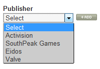
Single select list
- standard dropdown field
- to change options ordering to A-Z, click on advanced options
- example:
Multiple select list
- example:
Checkboxes
- example:
Radio buttons
- example:
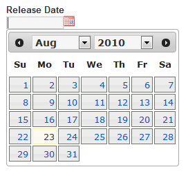
Date field
- date field uses jQuery date picker plugin
- example:
Adding field options and field options' images
After creating Single/Multiple select list, checkbox or radio button custom fields, go back to Field Manager and click on Add/Edit link to add field's options:
- Text: this is what the site visitor will see and it is translatable when using Joomfish
- Value: this is a reference value, the site visitor will not see it.
- Image: if you enter an image, it will be displayed instead of the text with the text as the title of the image.
For example, if your field has options like 'Yes' or 'No', you can display icons instead of those values.
Default path for the images: /components/com_jreviews/jreviews/views/themes/{theme_name}/theme_images/
If you write "image_name.jpg", it will look for the image in /components/com_jreviews/jreviews/views/themes/{theme_name}/theme_images/image_name.jpg
If you have a multilingual site, you can enter "image_name.jpg" and if you place images in the folder like "english.image_name.jpg" and "spanish.image_name.jpg" they will be used automatically.
Changing field's Output Format
On the Add/Edit Field screen click on [Click here for Advanced Options] where you can modify field's Output Format.
For most custom field types, Output Format is just this:
{FIELDTEXT}
{FIELDTEXT} is the field value entered when submitting listing/reviews and that value is displayed on listing details.
Modifying Output Format is useful when you want to change how the field is displayed.
Here are few examples:
